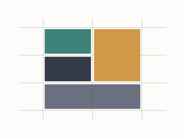
With CSS Grid now supported natively across Chrome, Firefox, Safari and Edge, the question we get asked most on client handovers is whether Grid replaces flexbox. It doesn't, and the reason is worth understanding rather than memorising: flexbox is one-dimensional, Grid is two-dimensional. Once that distinction is clear, the choice between them stops being a debate and starts being obvious per-component.
One axis versus two
Flexbox lays items out along a single line - a row or a column - and is genuinely excellent at that: a navigation bar, a row of buttons, centring one thing inside another.
.toolbar { display: flex; justify-content: space-between; align-items: center; }
Grid lays items out along rows and columns simultaneously, with items able to span multiple tracks in either direction - the shape a page layout, a dashboard, or a photo gallery with mixed tile sizes actually needs.
.dashboard {
  display: grid;
  grid-template-columns: 240px 1fr 1fr;
  grid-template-rows: auto 1fr;
  gap: 24px;
}
.dashboard .sidebar { grid-row: 1 / 3; }

A working rule of thumb
If you're laying out the page itself - header, sidebar, main content, footer, or a card grid where items need to line up in both directions - reach for Grid. If you're laying out the contents of one component - the icons and label inside a button, the items inside a nav bar - flexbox is usually simpler and does the job in fewer lines.
They nest inside each other constantly
.page {
  display: grid;
  grid-template-columns: 240px 1fr;
}
.page .card-row {
  display: flex;
  gap: 16px;
}
This is the pattern we use on nearly every project now: Grid for the page skeleton, flexbox for the components living inside each grid cell. Neither one is the "modern" choice that makes the other obsolete - they're both modern, and they're built for different shaped problems.
Browser support, finally, isn't the blocker
For years the honest advice was "Grid is great, wait for support." That wait is effectively over for current-browser targets, and a graceful fallback for the handful of older browsers still in the wild is a short @supports block, not a reason to avoid Grid on new projects.
One axis vs two - the actual dividing line
Flexbox distributes space along a single axis and is genuinely excellent at it - a nav bar, a button group, a card's internal layout of icon-plus-text all fit flexbox's mental model well. Grid handles both axes at once, which matters the moment content needs to align not just in a row but also down a column at the same time.
/* Flexbox: one-dimensional */
.nav { display: flex; justify-content: space-between; }

/* Grid: two-dimensional */
.page { display: grid; grid-template-columns: 240px 1fr; grid-template-rows: auto 1fr auto; }
They're not actually competing
Most real layouts use both: Grid for the page-level skeleton (header, sidebar, main, footer) and Flexbox inside individual components for arranging their own contents. Treating the choice as "which one do I learn" rather than "which one fits this specific layout" is the mental shortcut that causes the most confusion for people new to both.